Writing Intriguing Openings
Plus, the script to the first 30 pages of SPECTATORS!
Brian here, sending out this week’s bonus content a little earlier than usual, as I’m about to enter the fray at San Diego Comic-Con (and you can can check out my complete, updated schedule here).
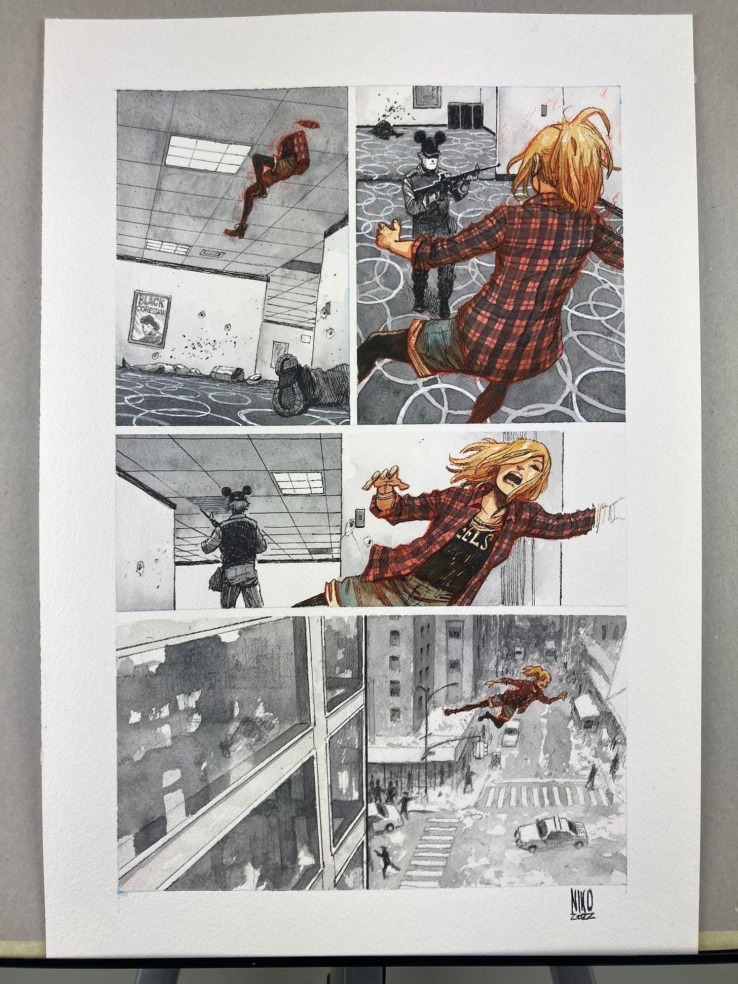
Speaking of SDCC, Exploding Giraffe’s own Niko Henrichon was generous enough to donate this original, hand-painted page of artwork from Spectators for an auction supporting the Comic Book Legal Defense Fund. Con attendees can swing by Booth #1918 for more details, and if you’re not at the show, you can still place an online bid though this email: auctions@cbldf.org
Right now, this is the ONLY way you can get your hands on original art from our book, except for our monthly giveaways to paid subscribers in The Tower (and the next contest is coming up shortly, so subscribe today to be automatically entered in that drawing!).
Anyway, I thought we’d discuss opening scenes this week, and to get us started, here’s the very first page of script to Saga #1 that I shared with co-creator Fiona Staples way back in 2011:
Fiona - So cool to be working with you! I love your style and your energy and your pacing, and I can’t wait to see what you do with this story. As you’ll see, my panel descriptions are sometime pretty detailed (and I’ll occasionally throw in annoying web links if there’s some specific visual that I’m too lazy to describe), but these are all just SUGGESTIONS. If you ever see a better way to layout a page or frame a shot or whatever, please go to town. And feel free to write or call anytime with questions/concerns/complaints. Maybe we can talk again after you’ve had some time to read through this beast. Have fun! - BKV
PAGE ONE
SPLASH
We open tight on a PROFILE SHOT of the right side of a panicked young woman’s face. We’re so close that her head fills almost the entire page.
This is ALANA, our heroine. She’s probably only in her early 20s, but her face is world-weary. She’s seen a hell of a lot in her years. Right now, Alana is SWEATING profusely; her face is slick. Her short-cropped, multi-colored hair is even more of a mess than usual. At the moment, Alana is a little heavier than she normally likes to be, but it lends a friendly softness to her face.
At first glance, Alana might appear to be an attractive human woman... but eventually, you notice the STRANGE THINGS jutting out from between her shoulder blades, strange things we can see only a glimpse of in this close-up. More on them shortly.
For now, all that matters is the fact that Alana seems terribly WORRIED about something. Her expression should be a mixture of horror and embarrassment.
1) Handwritten Narration*: This is how an idea becomes real.
2) Alana**: Am I shitting?
3) Alana: It feels like I’m shitting!
*A note for Fiona and/or our letterer: I’d really like to do something different with our Narrator’s “voiceover,” since it will run throughout the series. Rather that putting it in an old-school square caption box, I hope we could leave room in the artwork for it to appear like this narration was hand-lettered directly and organically onto the artwork, maybe in legible script instead of cursive? The handwriting should look adult, but it’s okay if it’s got some character to it, and it can occasionally playfully “interact” with the artwork. For example, here, maybe the narration can ARC in a semi-circle above Alana’s head? I know most artists hate their own handwriting, but because this narration is so native to the art, you may want to handle it yourself, Fiona. There won’t be too much of it in each issue, I promise...
**As for the regular dialogue, I’d love it if we could go with a readable mixed-case font instead of traditional ALL CAPS, which younger readers all tell me still looks like YELLING to them. I try not to over-emphasize words too often, so dialogue should only be bolded as indicated, please.
If you’ve seen the finished product, you know how magnificently Fiona (and letterer Fonografiks!) elevated my way-too-wordy description of that opening page, but I remain really proud of it, a single splash that succinctly presents the major themes and new style of our story, while also serving as both an invitation to curious adults to keep reading, and a warning to more conservative fans to immediately put this filthy book back on the shelf where they found it.
By the way, if you’d like to read the rest of the script to that first issue of Saga, a signed copy (along with a bunch of other cool prizes) is exclusively available to our generous Founders, a tier that will only be available until the end of this month. We may offer a different Founder package in the future, but it won’t contain that script or an original sketch from Niko Henrichon (who’s still meticulously working his way through our long list; thanks again for your continued patience, Founders!).
Speaking of Niko, when it came time to start writing Spectators, I felt that our serialized graphic novel could afford to open with a less outrageously attention-grabbing first page than Saga, but I still had very specific thoughts about what kind of image should greet readers:
Welcome to the next year(s) of your life, Niko! I can’t wait to summit this intimidating new mountain with you.
PAGE ONE
SPLASH
We’re going to open in the present, or at least what will be the present when these first few pages are released by Substack: January of 2022. Our 40-something protagonist, VAL NORWICH (long story, but I changed her last name and some biographical details from my original pitch to you) is sitting by herself in the back row of a movie theater.
Originally from a middle-class family in suburban Ohio, Val has been (barely) carving out a living in New York City since she came to NYU for film school in the early 1990s. Happily childless, Val has been dating on and off for the last two decades, rarely with much passion or long-term success. Moderately overweight and grayer than she used to be, Val nevertheless carries herself with stylish confidence. Maybe she’s got a youthful pink streak in her hair? As always, up to you, Niko!
Either way, Val seems to be looking right at us (her standard expression is one of understated interest) as she sits in a blood-red leather recliner like one of these: https://static01.nyt.com/images/2021/05/30/arts/30movie-essay3/30movie-essay3-superJumbo.jpg?quality=75&auto=webp
Dressed in jeans, boots, and a nice top, Val has left her bulky winter coat on the seat to her right (presumably for a friend), while the seat to her left has a crudely taped-over tear in its leather. Val’s got a medium popcorn resting on her lap, but she’s not yet eating.
Oh, and to help place us firmly in our (currently kind of lousy) real world, Val clearly has a blue SURGICAL MASK dangling from one ear.
No Text
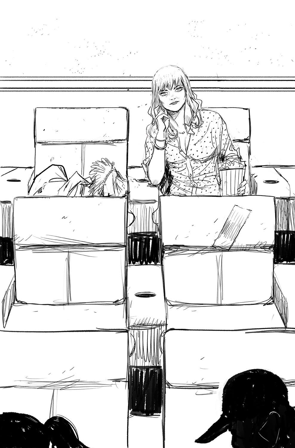
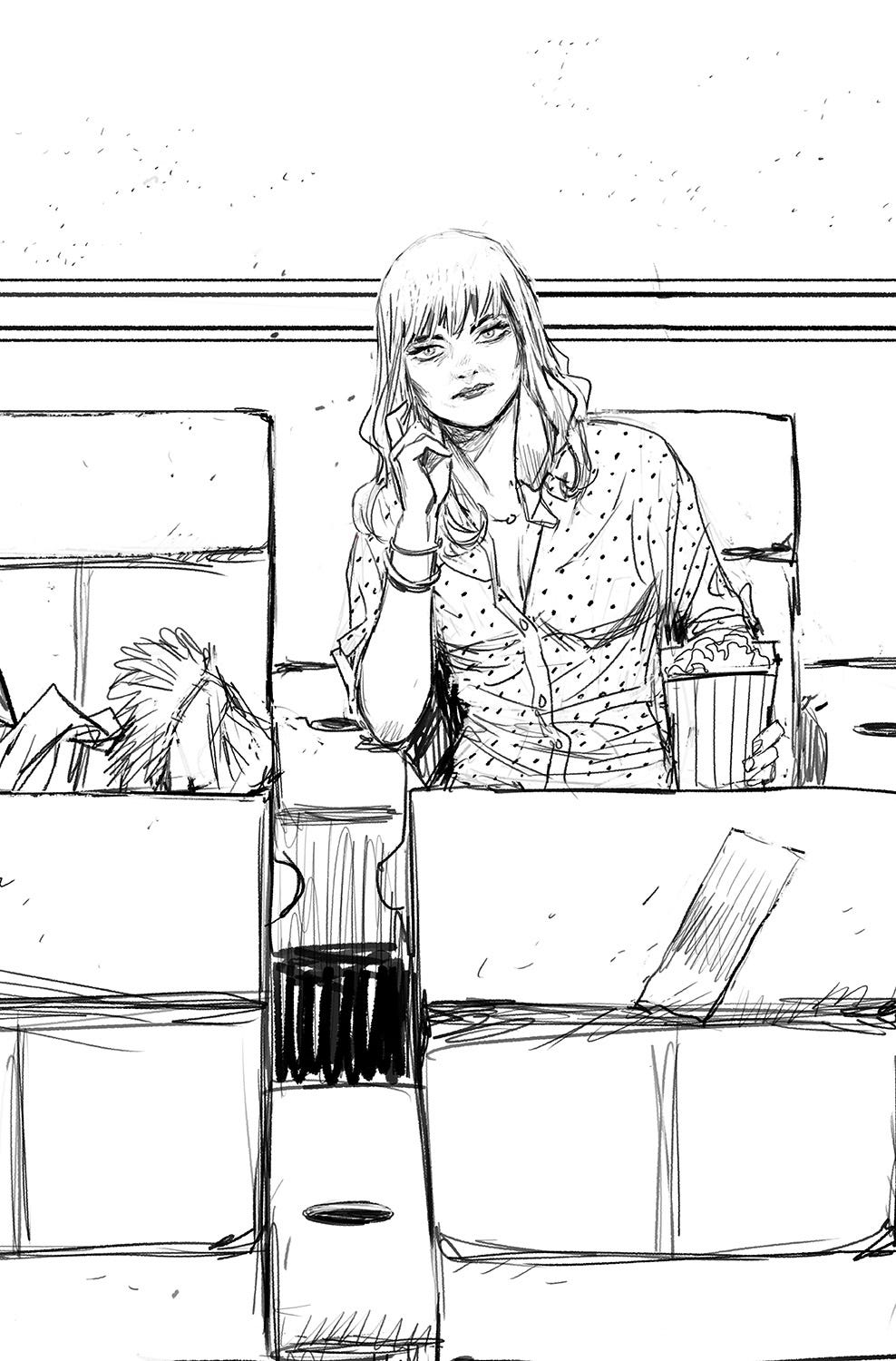
Because Niko is a tireless perfectionist, he sent TWO spectacular versions of this potential opening image with his initial (and highly detailed) layouts:
To which I annoyingly responded:
Hmm, yeah, everything about pages 2 through 10 is spot-on perfect, but I’m a little torn about this opening shot. I think I prefer your first take, but I might consider moving in even closer, and maybe centering Val in the shot (between two chairs), which might help sell that she’s looking right at “us.” Just a thought, but trust your instincts!
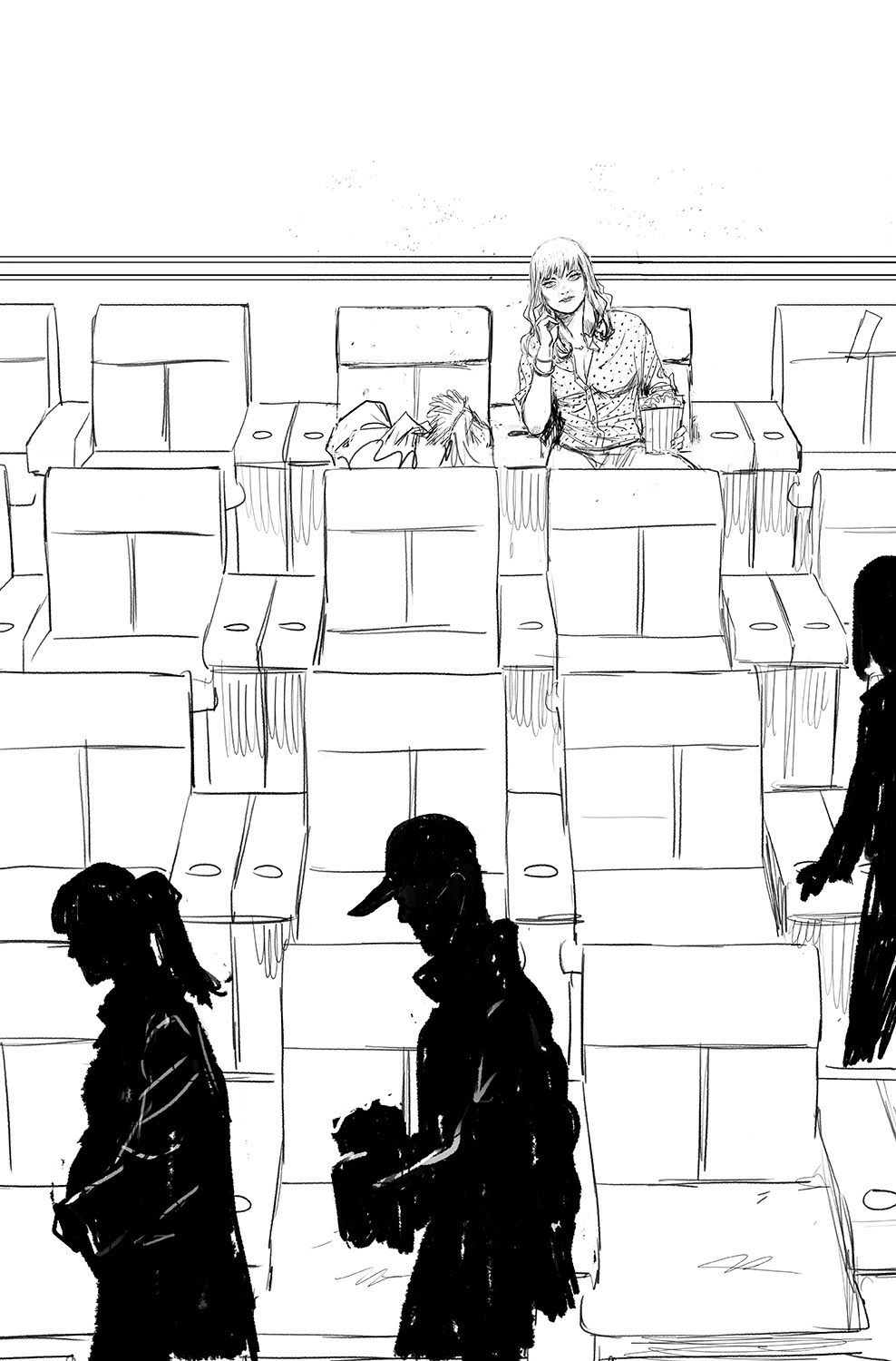
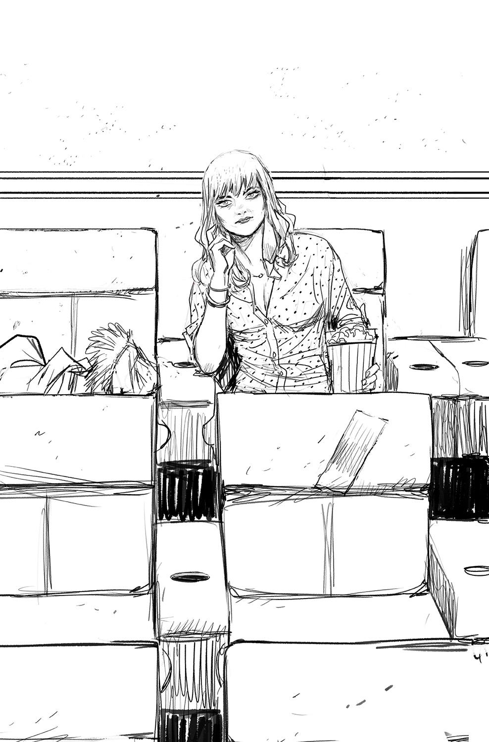
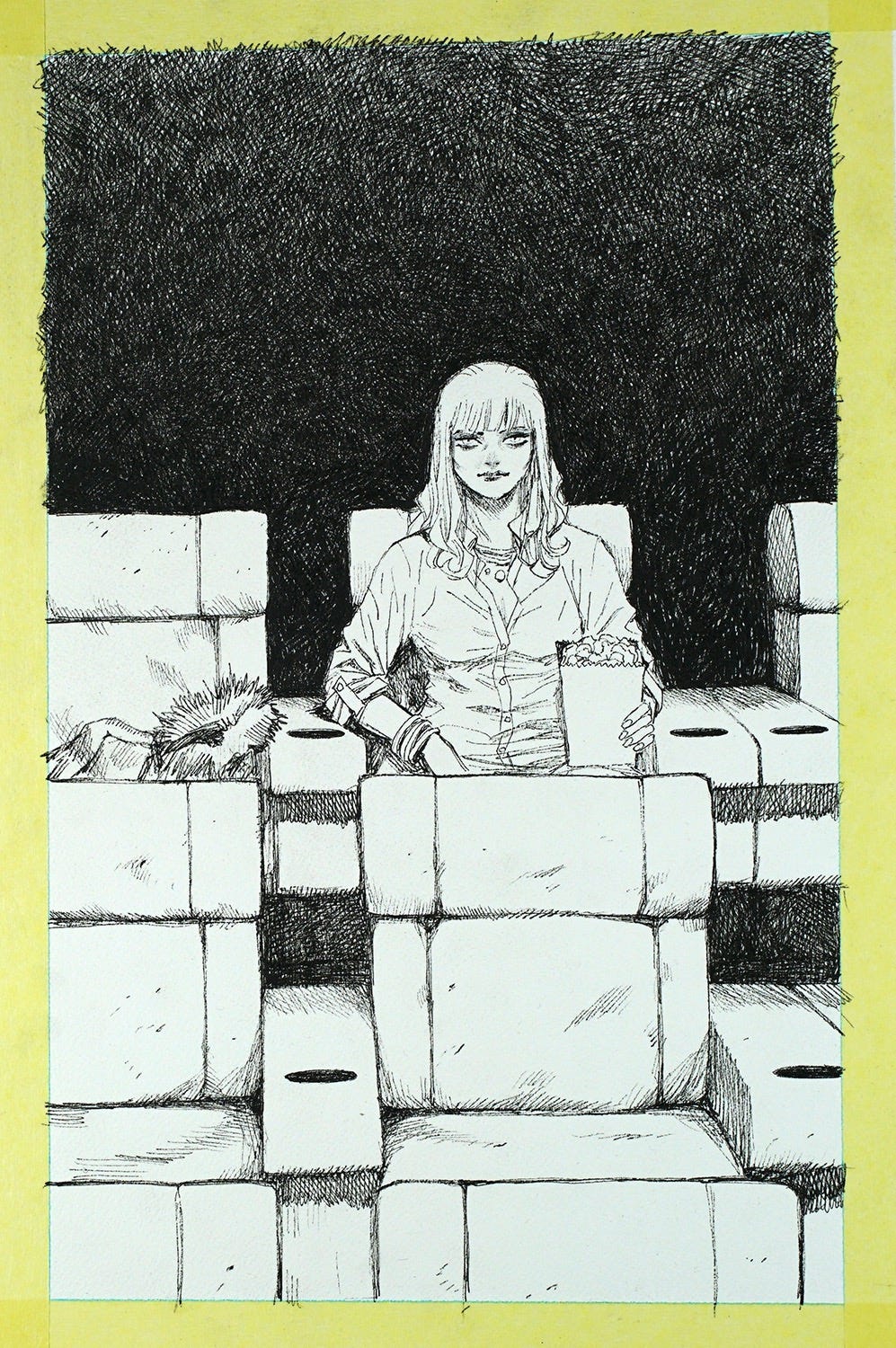
Undaunted, Niko came back with THREE more options, explaining:
I need to have your impression on what would make the best first page. I spent too much time thinking about it so your instinct will be fresher than mine. I was thinking of a slightly off-centered composition just to give a hint that the seat on her side is empty and she's waiting for someone. Please let me know what you think of these new layouts…
After I eventually emerged from the fog of Covid (which poor Niko would end up enduring shortly thereafter), I finally responded with this rambling:
Apologies, I’ve spent two weeks thinking about this dumb first page! So my instincts are anything except fresh. BUT, after staring at all three layouts, I think I most connect with your second image. I know it’s the least “dynamic” framing (with Val's head not being cocked at an interesting angle like in your other layouts), but the fact that her eyes are aligned with mine (the reader) is the connection I think we should be going for. And again, even though the composition is maybe less dynamic, I like that she’s a little more centered in the shot, since I realize this story isn’t about her relationship with the potential person next to her, it’s more about her unrequited relationship with the strangers she observes (in this case, “us”).
Am I overthinking this?? Almost certainly. And maybe you’ve already figured out the perfect take! As always, please trust yourself. And thanks for each of these incredible new layouts (which will also make great fodder for future behind-the-scenes newsletters!).
Look at me, being an unhelpful douche of a collaborator, but already thinking about you future subscribers to Exploding Giraffe!
Anyway, Niko soon responded with the perfect image, which instantly conveyed with grace and subtlety everything I was struggling to describe:
I know, an obscene amount of effort for a silent picture of a lady sitting in a chair, but this shit really matters when setting the tone for a new story, so I’m endlessly grateful to Niko for his patience with me and his dedication to the craft.
Anyway, I encourage you to also check out Niko’s final color version in context of our complete opening scene, and if you’d like to read my full script for all of our first 30 pages of Spectators, I’ll include that for our paid subscribers in The Tower after this paywall.
Regardless, Niko and Fonografiks will be back with more of their genius Spectators work on Monday, and if I survive SDCC, I’ll see you then, too.


