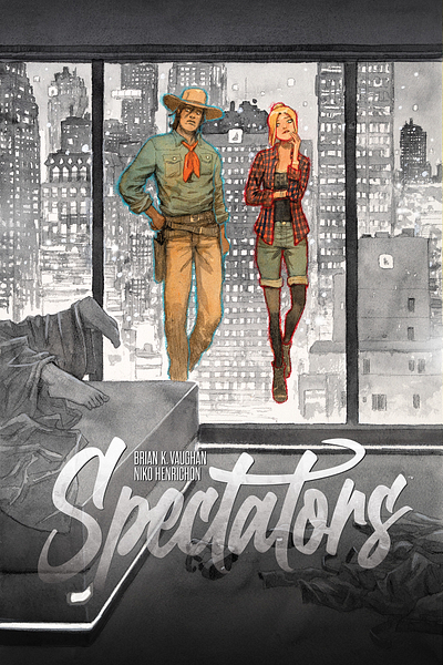
SPECTATORS - Part 79
Plus, a very sexy Artopsy from Niko Henrichon!
We (tentatively) did it!
Brian here, cautiously thrilled that the Writers Guild of America has reached a tentative agreement with the studios to finally end a strike that feels like it started several years ago.
I’m so proud of my amazing union and our steadfast leadership, and relieved for my colleagues who’ve been hurting. Selfishly, I can’t wait to get back to work on the most exciting screenplay of my strange career, but I also wanted to assure you that the creator-owned comics my collaborators and I are lucky enough to bring into the world have always been and will always be my first priority.
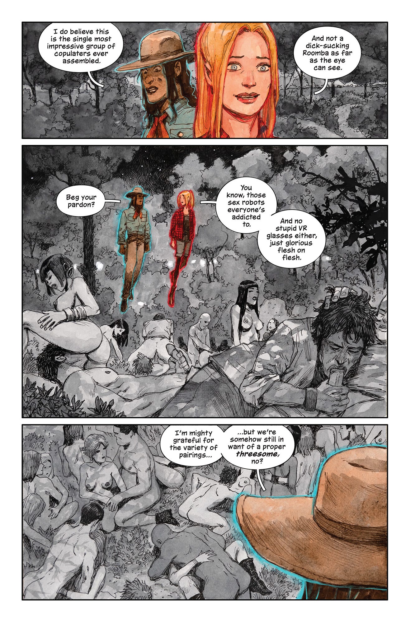
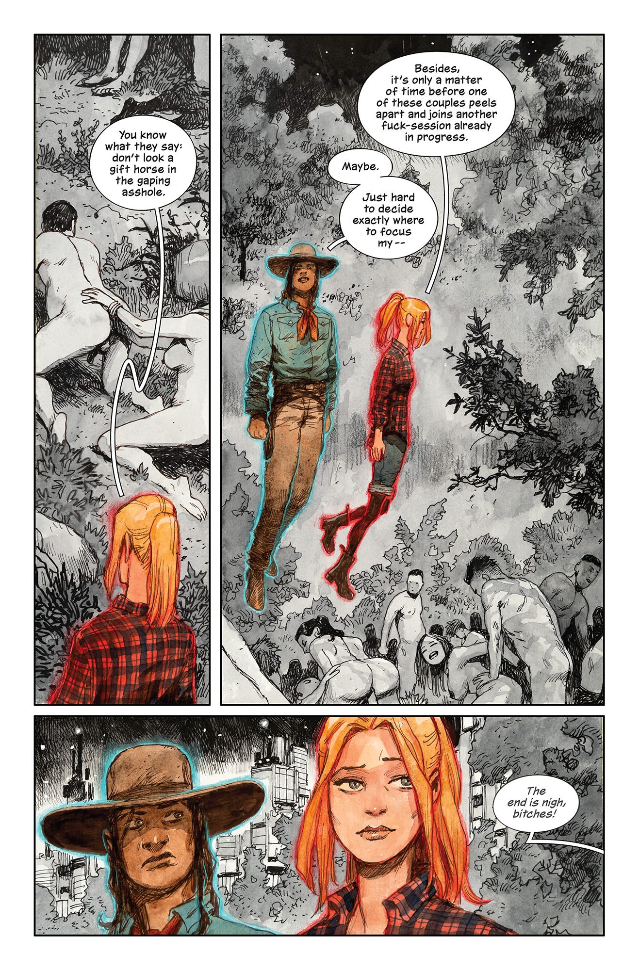
Speaking of which, artist/co-creator Niko Henrichon and letterer Fonografiks have some gorgeous NOT SAFE FOR WORK action for you in this evening’s installment of Spectators, as our ghostly protagonists Val and Sam drift through an impromptu orgy in the Central Park of New York’s distant future…
I know the subject matter is scandalous, but isn’t Niko’s black-and-white artwork classy AF?
Anyway, it’s time for one of you lucky members of The Tower to take home another sumptuous page of Niko’s hand-painted original Spectators artwork, and this month’s randomly selected reader is… Ilsa E.!
Congrats, Ilsa, and the artiste himself will be reaching out for your mailing address soon.
You can always find more of Niko’s original artwork for sale through Essential Sequential, but you paid subscribers get a special discount at that site AND have tons of additional prize opportunities like these monthly giveaways, so I hope you’ll consider joining our merry group of giraffes today, thanks again:
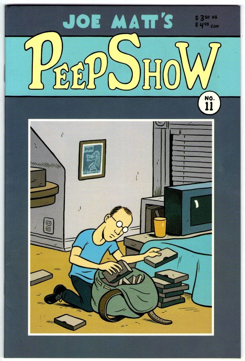
Last week, I was crushed to learn that we lost one of my favorite cartoonists, Joe Matt.
I’ll have much more to say about Joe and his work in next week’s dispatch, but for now, I wanted to send my deepest condolences to his friends and family, and encourage you to check out some of the thoughtful remembrances from Heidi MacDonald and Joe’s pal Ed Brubaker.
To be continued…
For you aspiring comic-book writers/artists, here’s an opportunity you can’t afford to miss from friend and mentor Mark Waid and his fellow legendary creator Howard Chaykin:
Howard Chaykin and I have built Comic Book U, a comprehensive, all-day boot-camp class on creating comics and graphic novels, and we’re debuting it Saturday, November 18 at UCLA.
Amazing. If you’re anywhere close to UCLA and available that day, you MUST attend.
More details here!
Before I turn the controls over to my creative better half for a very sexy Artopsy (for you most welcome new readers, this is Niko’s monthly “artistic autopsy”), I just wanted to thank everyone for the very kind words about last week’s Saga #66, which surprised us all by selling out completely, at least at the distributor level.
If your friendly neighborhood comic shop needs more copies, good news, Image is racing out a SECOND PRINT (with a slightly tweaked logo treatment by the endlessly brilliant Fonografiks) that should be on stands soon.
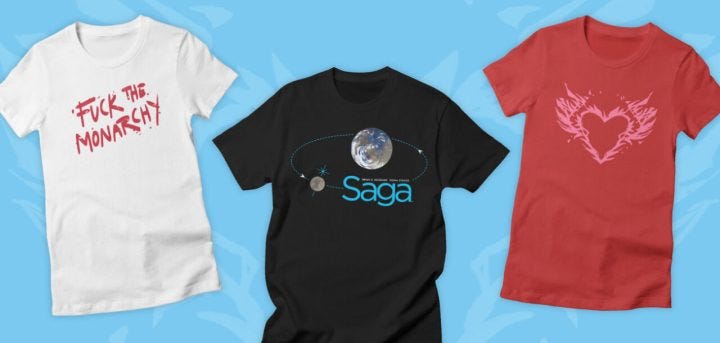
In the back of that same sold-out issue, Saga artist/co-creator Fiona Staples and I finally revealed our fantastic new Threadless store (lovingly managed by our mutual bestie Ben Rankel), where you can pick up all sorts of cool new Fiona-designed shirts and prints, including “in-universe” deep cuts like this gem:
And for our all-important comic-book retailing partners, you can now contact vip.shops at threadless dot com to find out more about generously discounted wholesale orders for your stores.
In support of our new endeavor, Fiona and I did a rare joint interview with some really fun questions and answers like these:
Which Saga character do you most relate to and why?
Fiona: Probably Doff, just trying to make pictures and do the right thing and have a nice time.
How’d that work out for him, Staples?!
Check out more at the link above, and prepare to CONSUME.
Oh, and I promised to give away a signed copy of Saga #66 to one commenter from last week’s chat (about your alarmingly early plans for Halloween costumes), and our intern Genesis the Exploded Giraffe selected industrious Tower member Alan H., who shared:
My wife and I are expecting a new baby any day now to go along with our 6-year-old, and our costumes this year are going to be MOVIE THEATER CONCESSIONS SNACKS
Dad: Soda
Mom: Hot Pretzel
Older daughter: M&Ms
Baby daughter: Box of popcorn (in her stroller)
We’ll need pics after the big day, please, Alan. Wishing you and your new food items all the best.
I’ll be giving away more signed issues (and much more merch from our new shop) to you generous Tower members in the weeks to come, but for now, thanks so much for reading, and I’ll see you back here next Monday for more free Spectators.
Take it away, Niko!
For this month’s Artopsy, I thought I’d show the process behind a recent salacious double-page spread from Spectators. So it goes without saying that this entry is definitely NSFW.
First, here’s Brian’s script:
Pages 190 and 191
DOUBLE-PAGE SPREAD
And now we’ve reached the aforementioned RUSTIC STONE ARCH BRIDGE (or really any area of the Ramble you feel like drawing, Niko), where AT LEAST ONE DOZEN PARTIALLY UNCLOTHED COUPLES ARE ENGAGED IN VARIOUS GRAPHIC SEXUAL ACTS.
These clearly adult duos can come in all sizes, races, genders, sexual orientations, but each person is only having relations with their individual partner, NO threesomes or other versions of group sex, please.
On our left, we can be behind Val and Sam in the foreground, as they gawk at what’s going on in front of them (they’re the only two ghosts here): for example, a MIDDLE-AGED LESBIAN going down on her GIRLFRIEND, a HUSBAND being aggressively fisted in the ass by his laughing WIFE, two GAY MEN giving each other simultaneous handjobs, a TRANS COUPLE making love against the stone wall, etcetera.
Let me know if you need more ideas, Niko, but we should be seeing an almost overwhelming variety of joyously depraved acts, please!
No Dialogue
I said it a couple of times already but I need to express once again my appreciation for doing comics in 2023. The blessings of computers and the internet make our job so much easier. The following example is very representative of that.
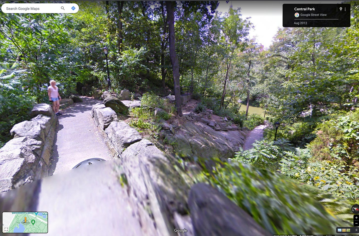
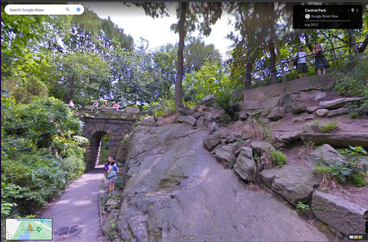
This scene happens near the iconic stone arch in the Ramble section of Central Park in NYC. As a reminder, I’m currently living in France and have absolutely no memory of my last (and only) visit to Central Park when I was a kid. And I’m not even sure if I was even in the Ramble part. Therefore, I needed some proper visual reference for that scene.
It took me around thirty seconds to get to a walkthrough of the site on Google Maps. After moving around to get a feeling of the environment, I took a few snapshots and I was ready to draw.
Imagine that same situation in 1992!
The best solution—after the solution of traveling by myself to the USA—would have been to call a friend in NYC (expensive long distance call). Supposing I had such a friend there that liked me enough to help me out, I would ask that friend to take pictures of the site. Then he would have to ship to me, by mail, either the 35mm film cartridge or the printed pictures.
A pretty complex operation, right?
Another option that I used a lot in the 90s was to go to a public library and hope they keep some very exhaustive books about Central Park. [When I first started writing comics in the 90s, I used to dig up physical reference photos/drawings for my collaborators from the vast collection at the New York Public Library (not far from Central Park, actually). Sorry I’m no longer able to provide such white-glove service, Niko! - Butting-in BKV]
Sometimes, I would also find good references in National Geographic magazines. I remember I kept hundreds of these magazines in my place that I was getting for almost nothing from used bookstores.
I wonder if younger artists realize the opportunities they have? I suppose you appreciate it more when you also lived in the pre-internet world.
Anyway, that world is behind us. Let’s dig into the work itself. Here’s the initial layout of the scene. Notice my classic perspective grid on the arch (thank god I don’t have to draw that grid on the page).
Also, you might be intrigued by these color dots on our busy couples. They are there for me to remember which Photoshop layer they belong to so I can move them around and size adjust if I need to. And I did a lot of moving around on this complex composition…


