Comics Artopsy #6
An intravenous injection of color, plus a Star Wars booster!
Hi everyone, Niko here, back for another “artistic autopsy” of my way of creating comics pages.
We had a lot of new readers join us this week, so if you’d like to check out my past Artopsies on layouts, inking, covers, etc., please head over to the Exploding Giraffe Archives.
Today, we’ll be looking at the coloring process.
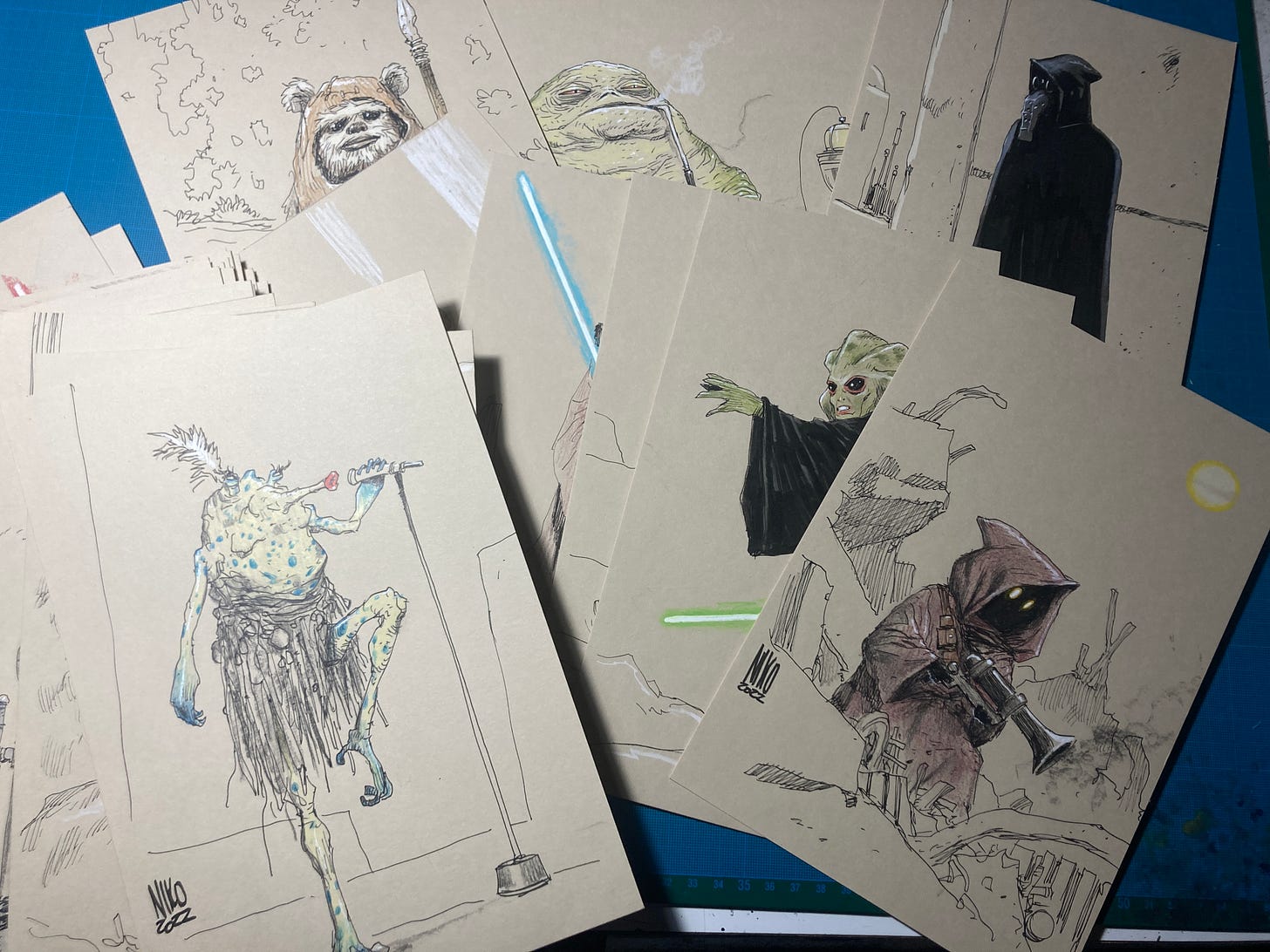
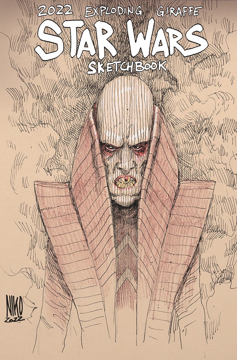
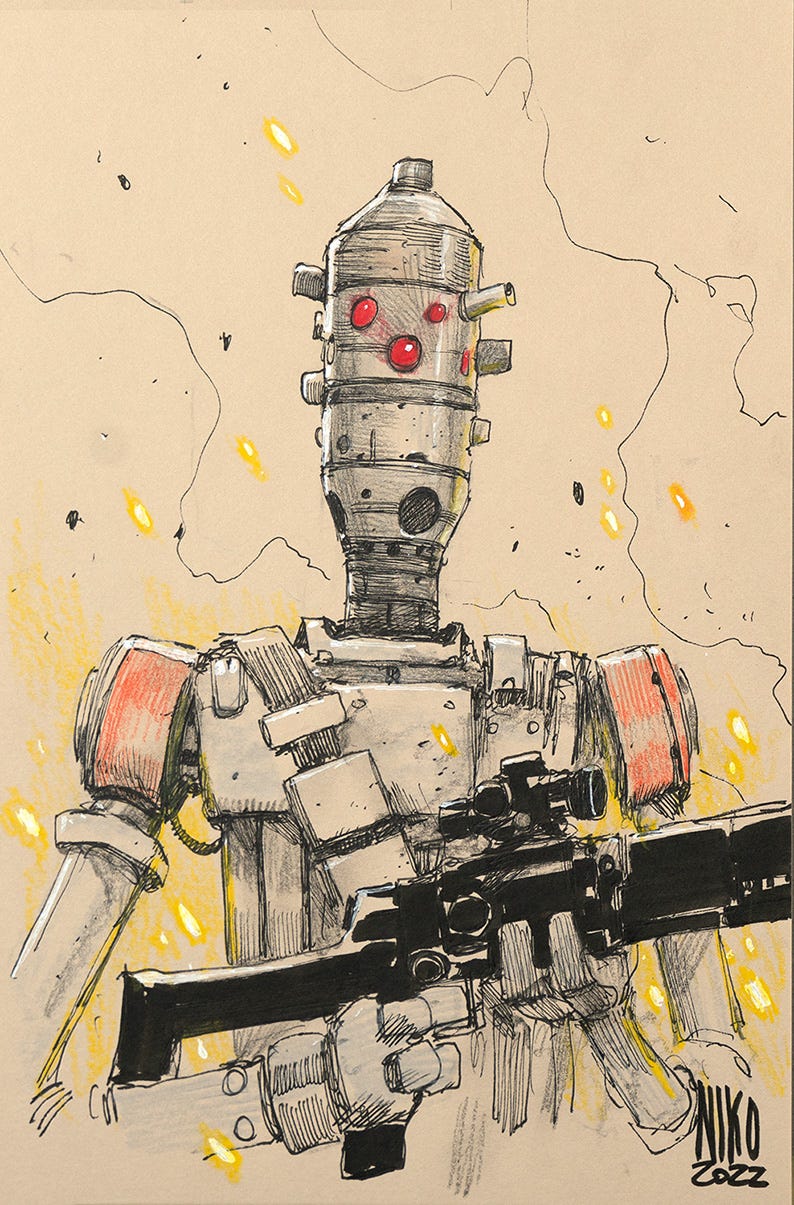
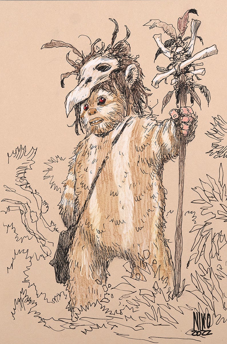
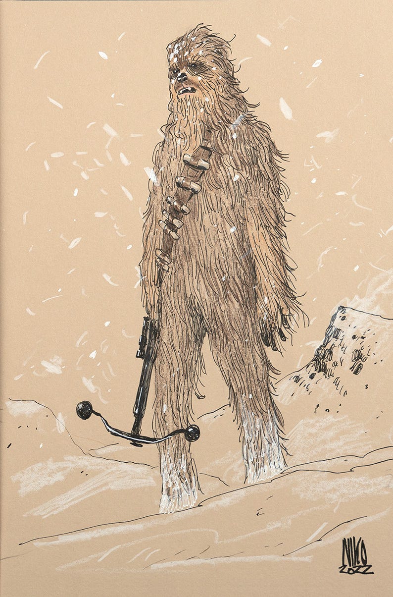
But first, here’s a small taste of the exclusive Star Wars sketchbook PDF that all of our generous paid subscribers will be able to download at the end of this post. This is a digital collection of all of my most recent original art sketches created exclusively for our Founder level subscribers’ Prize Packages (thanks again for your patience, Founders!).
I think I did most of the known characters from Episodes IV, V and VI, which are the movies that really shaped my childhood imagination. But I quickly ran out of characters and ended up doing some from the more recent movies, Rogue One, Solo and the animated shows as well.
I can’t say that I’m super familiar with all of those, but I found a lot of the most recent character designs to be incredibly interesting, and I tried my best to draw them in a coherent way.
There are 63 sketches in this latest batch, and here are just a few:
Now back to our main program!
My colouring technique (or “coloring” as you spell it in the States) is relatively simple. I start with a layer of basic colors for everything on the page and then work on the shadows over it. After all that, I refine and fine tune the details.
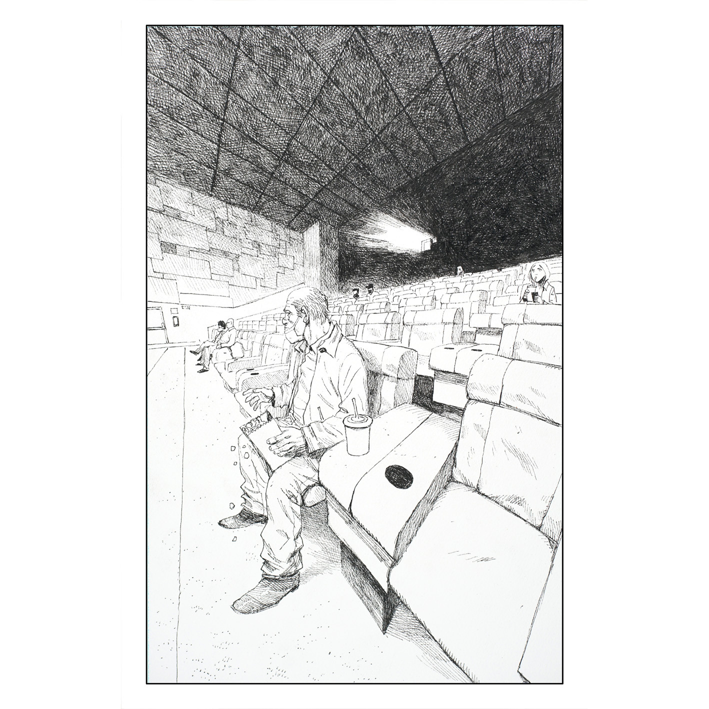
Here’s an early page of Spectators that I’ll use as an example. Obviously, before the coloring step, the page is black and white, and looks like this:
The important thing when coloring artwork is to have the inked work done on a good quality, water-tolerant paper.
The trouble is that not every excellent quality paper for inking is ALSO good to handle watercolor paint, which is the technique I’m using for colors. So I need to make tough concessions here.
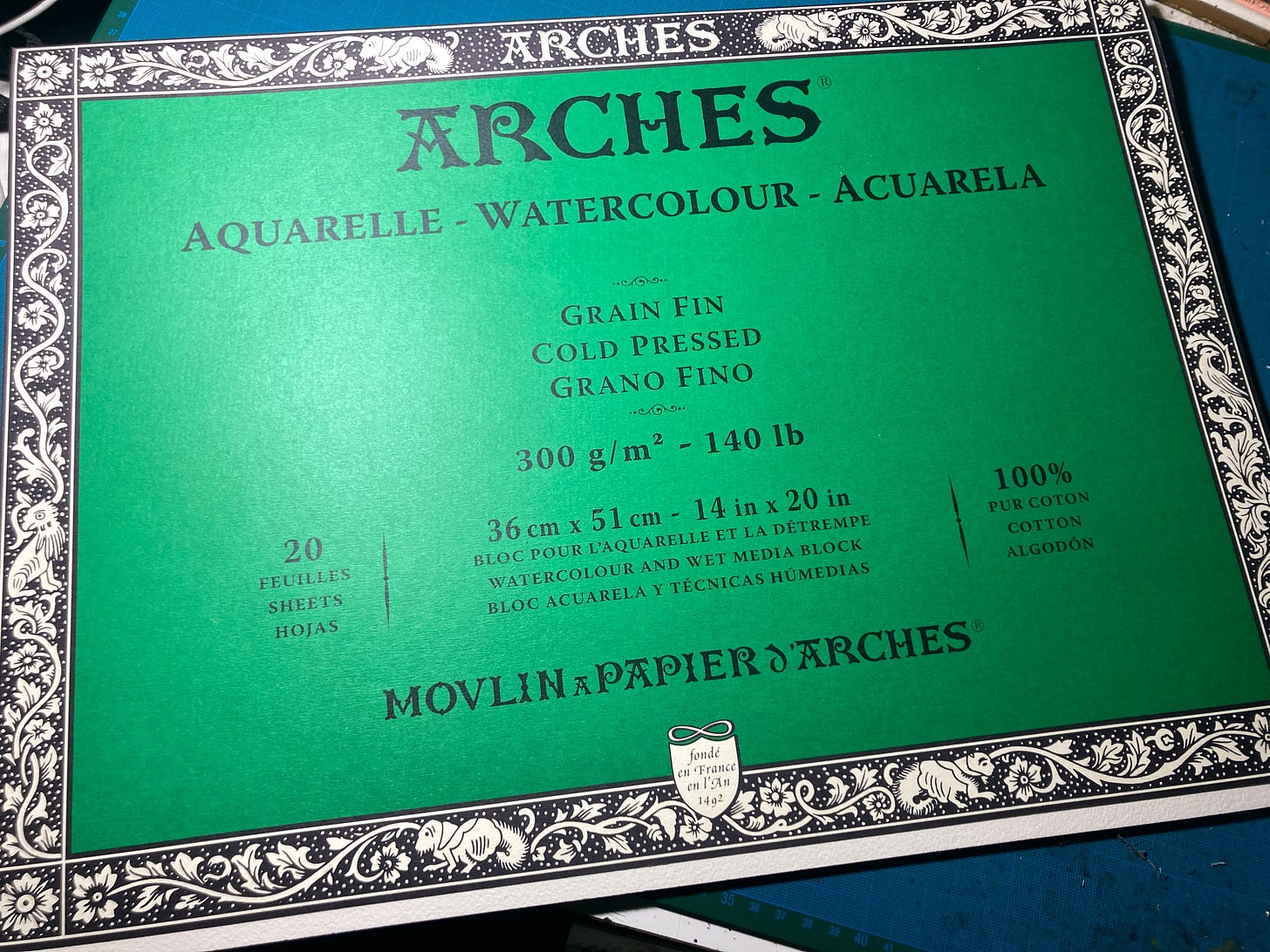
I can’t use my all-time favorite inking paper, but I found some watercolor paper that’s all right for inking and amazing for colors. It’s the French-made, cold-pressed (which means that is has a fine grain texture on it), Arches watercolor paper.
It’s an amazing quality paper that happens to also be easily available where I live.
Another tricky thing is the need to have inked artwork with no scratch or white corrections of any kind because they could mess with the colors and produce unexpected results (that can either become amazing experimental pieces of art or hair-pulling artistic tragedies).
In the context of tight comic deadlines, it’s often preferable to minimize the risk, so the line art needs to be impeccable.
Here’s an early video where I’m laying down the basic colors…
[BKV here, stepping in to ruin the fun for you free subscribers, as these amazing process videos (and a look inside Niko’s photography studio?!) are exclusively for our paid members in The Tower. But if you’re an aspiring artist—or just a lover of the medium curious about Niko’s wholly unique process—I hope you’ll join us, especially because you’ll also get to see all 63 of Niko’s most recent original art sketches, which our intern Genesis the Giraffe will be mailing out to our next batch of lucky Founders before the end of the month. Thanks so much for reading, and Niko and I will see you back here on Monday for more free Spectators!]


