Comics Artopsy #4
An endoscopy on cover art
Surprise! Today is Comics Artopsy day, your monthly rendezvous with me and the backstage of my craft.
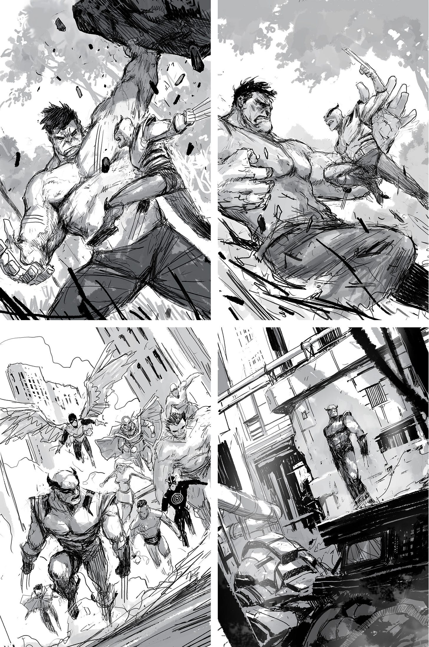
Readers are generally only given access to the tip of the iceberg (the final product) regarding comic covers. As you may suspect, on the way to the final version, there’s a ton of work that often never sees the light of day. I’m seizing this occasion to show you a bunch of different layouts that have been presented to my different editors in order to end up with our final cover.
Sometimes, I think a have enough good ideas in two or three sketches, but on other times I end up drawing more than ten different layouts and still not being sure I have one that’s worthy. The editor makes the final choice, obviously not always the one I prefer. And, most of the time, the more classic the layout, the more likely it is to be chosen.
When I look at the below sketches in a group like this, it almost makes me want to paint the rejected layouts and sell them as commissions.
But not now! I’m way too busy with Spectators. Let’s put this idea on the side and keep it for later…
We’ll start with a recent one: X-Men Legends
Here are several different layouts I tried:
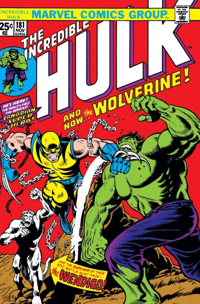
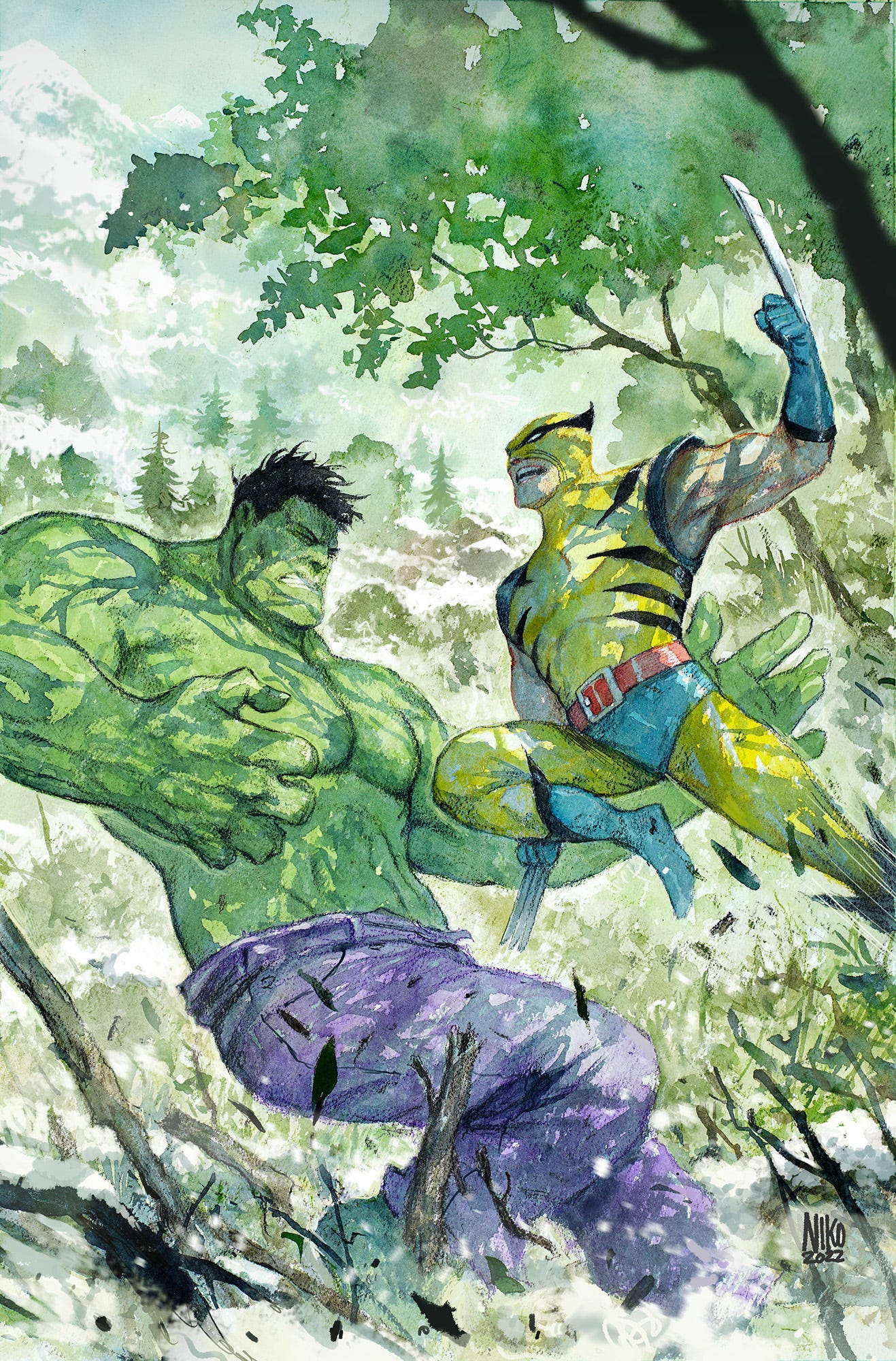
We ended up picking a classic scene from Hulk #181:
In this issue, Hulk fights Wolverine in an early version of Logan’s costume. From the colors of the book, I didn’t initially understand the scene was happening in winter, so I had to add some extra snow and ice on the final cover.
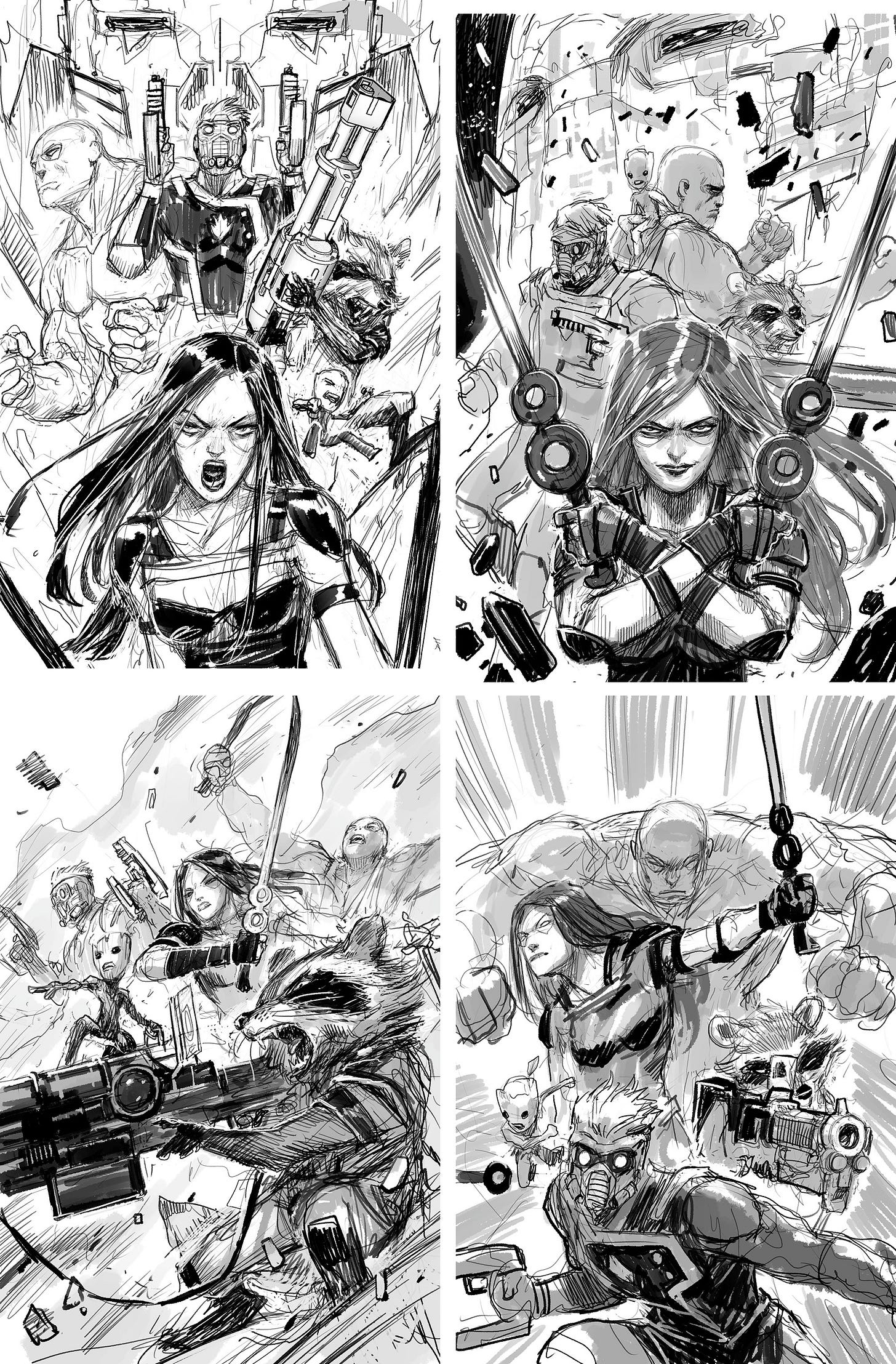
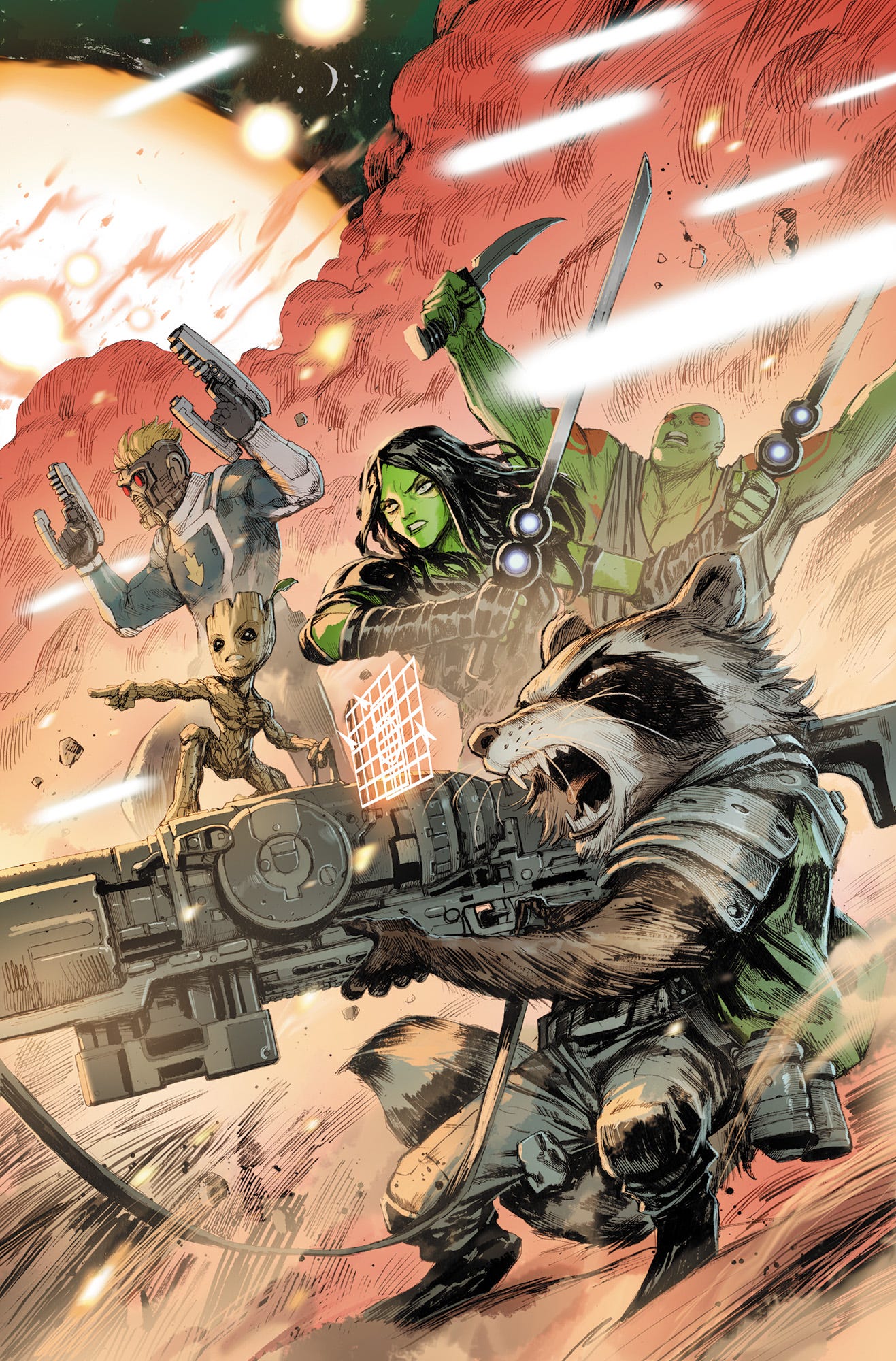
Next: The All New Guardians of the Galaxy #2
Definitely my favorite Marvel type of universe, so I was highly motivated to work on this one. I think the movies are also my favorites of the whole MCU.
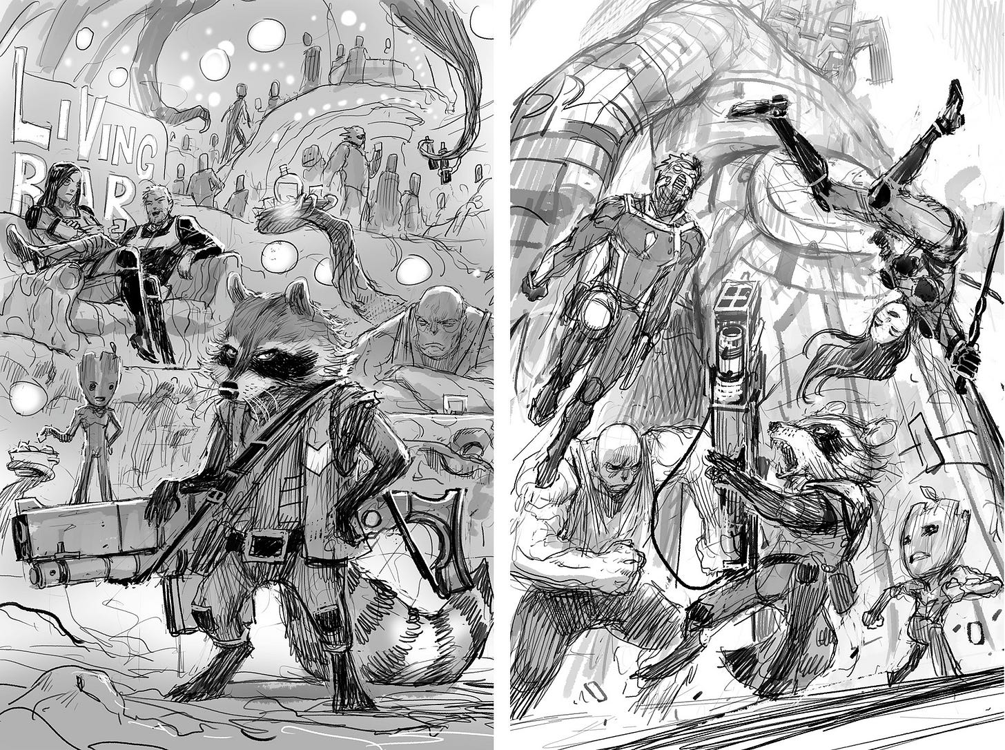
I tried many different possibilities here because the editor wanted a cover that was not specifically story related. It was just supposed to feature the team we all know and love.
I went in many directions including an imaginary “living” bar where clients are serviced by the various tentacles that hang around.
Here’s the final version (can you spot the Star Wars nod?):
BKV here, sorry to interrupt this incredible look at Niko’s tireless process (he draws like an entire issue worth of layouts for each cover!).
We don’t want to crash your inboxes, so we’ll part ways with some of you here, but after the paywall, you generous paid subscribers in The Tower will be treated to a lot more commentary from Niko and THIRTY additional never-before-seen images (which you can also access at Exploding Giraffe or via the Substack app), including the many gorgeous layouts that resulted in one of my personal favorite covers of all time. Can you guess which one?
Enjoy, and we’ll see everyone on Monday for more free Spectators!


